Notions about what constitutes a broadside are as discerning and various as people’s motives for producing them. The OED defines a broadside as, ‘A sheet of paper printed on one side only, forming one large page.’ That’s okay, but using the word ‘page’ is a bit confusing because a ‘page’ is defined as ‘either side of a leaf’ in Glaister’s An Encyclopedia of the Book. In ABC for Book Collectors, John Carter says that the term ‘broadside’ applies strictly to a whole, undivided sheet. And how ‘large’ is a ‘large’ sheet of paper? Is a small broadside a handbill? Is a larger than ‘large’ broadside a poster? To make matters murkier, about half the examples discussed here are printed on two sides, usually just a colophon, but technically, that’s enough to throw another serious wrench in the OED. Although a finite definition of the term may be difficult to surmise, people invested in this fugitive form of literature agree that these inky leaves should not be regarded as ephemeral detritus, nor should they be written off as mere sentimental keepsakes.
The broadside has played a fundamental role in educating and instigating revolutionary social, literary, and political movements. Like the leaflet, handbill, and pamphlet, the broadside is a form of street literature, a public work of art designed to be read outdoors, rather than in the library. Unlike the book, which can be perceived as a private, usually closed, one-on-one reading experience, the broadside is public, open (literally impossible to ‘close’), form of art that encourages a communal reading experience. Shortly after the invention of moveable type in the fifteenth century, royal proclamations and official notices were printed as broadsides. Broadsides later became a vehicle for political resistance and the expression of opposition to authoritarian rule. They were even used for the dissemination of scaffold speeches by condemned criminals in the moments preceding their execution. In the early sixteenth century, poems and ballads were printed in this form in England, where blackletter fonts continued to flourish long after the introduction of Roman type—hence, black-letter ballads. I consider broadsheets, stall or street ballads members of a family of printed forms known as the broadside.
In twentieth century America, the poetry broadside blossomed in the sixties and seventies. In the revolution of print culture spurred on by the New American Poetry’s intersection with the mimeo revolution and a new wave of innovative printers and book artists, the broadside became something of a radical courier for self-expression as well as a quick, DIY medium for social and political transformation. It served as an ideal way to promote and commemorate events such as Happenings, rock concerts, dance performances, and poetry readings. In turn, the construction and distribution of broadsides, magazines, and pamphlets became popular underground occasions for impromptu gatherings around second-hand Vandercooks, homespun silkscreen equipment, and saddle staplers. The establishment of various centers for the book, venues for poetry readings and publishing alike such as the St. Mark’s Poetry Project or Clifford Burke’s open studio at the Cranium Press in San Francisco contributed to the economic and technical viability of bringing the private voice into the public sphere with efficiency, flair and immediacy. James Sullivan poignantly stakes his claim in On the Walls and in the Streets:
This usefulness took poetry out from between closed covers resting on shelves, out of the armchair under the reading lamp, out from those quiet moments of private contemplation that have become the canonical setting for poetry, and into public places. Handed out at meetings, rallies, and street corners, posted on walls and bulletin boards, even framed to be hung in a living room or gallery or carried around all day folded in a wallet, a poem became a material sign to be touched and seen, engaging the senses rather than, as is conventional, passing transparently through them on the literary intellect.
Contempoary printers working out of the private press tradition distinguish their broadsides from the ephemeral, utilitarian function associated with posters and public notices that job printers produce. Non-commercial, independent publishers of poetry represent another tradition, while those working for or with activist groups and independent news agencies have a different approach, and of course, there are infinite connections and gaps between each of these tendencies. Charles Alexander,direc tor of Chax Press,writes "What a treat to make broadsides! Especially for folks like most fine press printers, who are stretching,and love to strive with limited resources of type to explore the possibilities of a single surface."
1. ANYTHING BUT POETRY
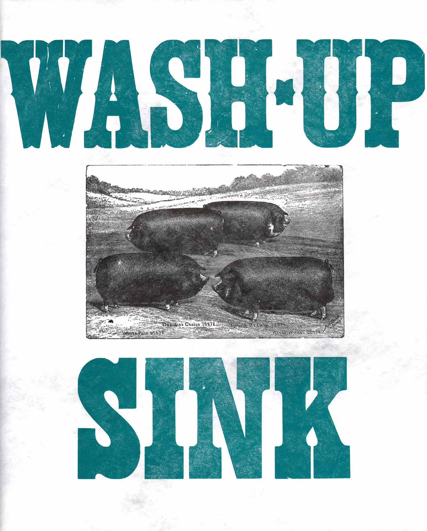
Just as poetry doesn’t have to be printed on a broadside, broadsides don’t have to display poetry to be what they are. You might call this an example of a broadside, or you might just call it a sign, and either would be fine. Wash-up Sink was produced at the Silver Buckle Press at the University of Wisconsin. Although there is no date, I acquired this copy around 2000 direct from the press. I like to think of the broadside as a public surface with a civic purpose, and this utilitarian example certainly is. Printed from attractive woodtype on Tyvek, this waterproof broadside is guaranteed to weather many an inky post-letterpress hand washing ceremony and inspires me to try printing a weather-resistant, yet ephemeral, broadside to display on telephone poles in the neighborhood.
Broadsides have a long political history; this one promotes physical fitness and ecological consciousness. Printed from woodtype using a variation on the rainbow roll, the bright orange ‘BURN’ is sure to catch the attention of pedestrians and motorists alike at a busy intersection. The colors connote the sun’s increasing intensity due to global warming, but also serves as a metaphor for people’s potential to change their ways (‘tomorrow’s a new day,’ etc.). Karen Randall of Propolis Press in Western Massachusetts sent me some books in the mail wrapped in this sheet, hence the folds and scotch tape. I like it so much I kept it on the fridge for over a year, but I never learned who printed it or why. Sometimes the best works of art are anonymous.
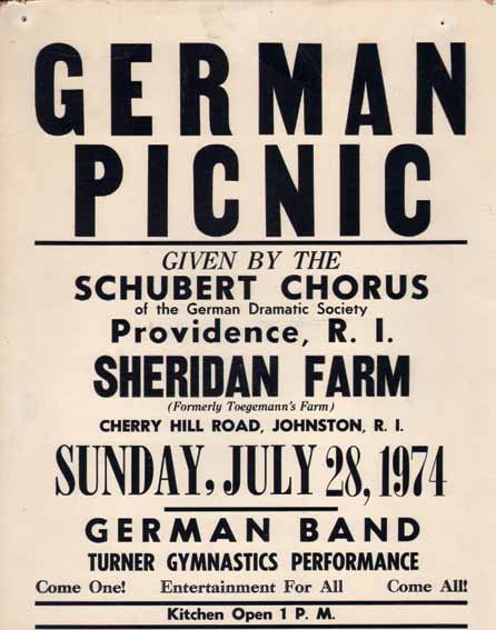
Come One! Come All! Here’s another anonymous broadside meant for display on the street. It’s a solid piece of job work that combines wood and metal type, mixing weights, serifs, and sans serifs. It’s centered on semi-gloss card stock. This is a fine example of utilitarian printing with an explicit message and clear, purposeful intention to quickly inform people of the German Picnic—but this isn’t my idea of a picnic! Where’s the sunshine? The cold hefeweizen and hot bratwurst? Sunshine and frolicking children? The heading ‘German Picnic’ is a bit authoritative, more reminiscent of a ‘no parking’ sign than a warm invitation. I bought this at a thrift store in Rhode Island about a decade ago. At that time, I was pleasantly surprised to learn that the city still printed their parking tickets letterpress, although I wasn’t very pleased to received one on Benefit Street!
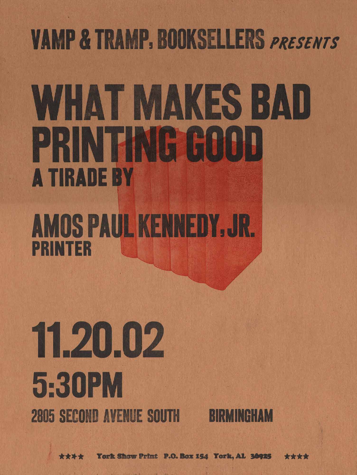
This broadside also promotes an event, this time at Vamp & Tramp books in Birmingham, but the message is a little more intriguing than the last example, especially for people interested in books and printing. Bill Stewart of Vamp & Tramp told me that this was Kennedy’s response to Paul Moxon’s earlier lecture at the bookstore titled ‘What Makes Good Printing Good.’ The chipboard stock, inky smears, and uneven inking make the medium and the message congruent. It’s also worth noting that the printer made this to promote his own lecture, so the theory and the practice, the event and the artifact, are all of a piece. It is printed on two sides, so if you’re an OED devotee, this doesn’t pass as a broadside, and I’d be okay with calling it a poster or a sign as well. I like this piece because it reminds me that when it comes to letterpress, there are as many rules as there are reasons to break them—even Bringhurst says something to that effect in the introduction to The Elements of Typographic Style.
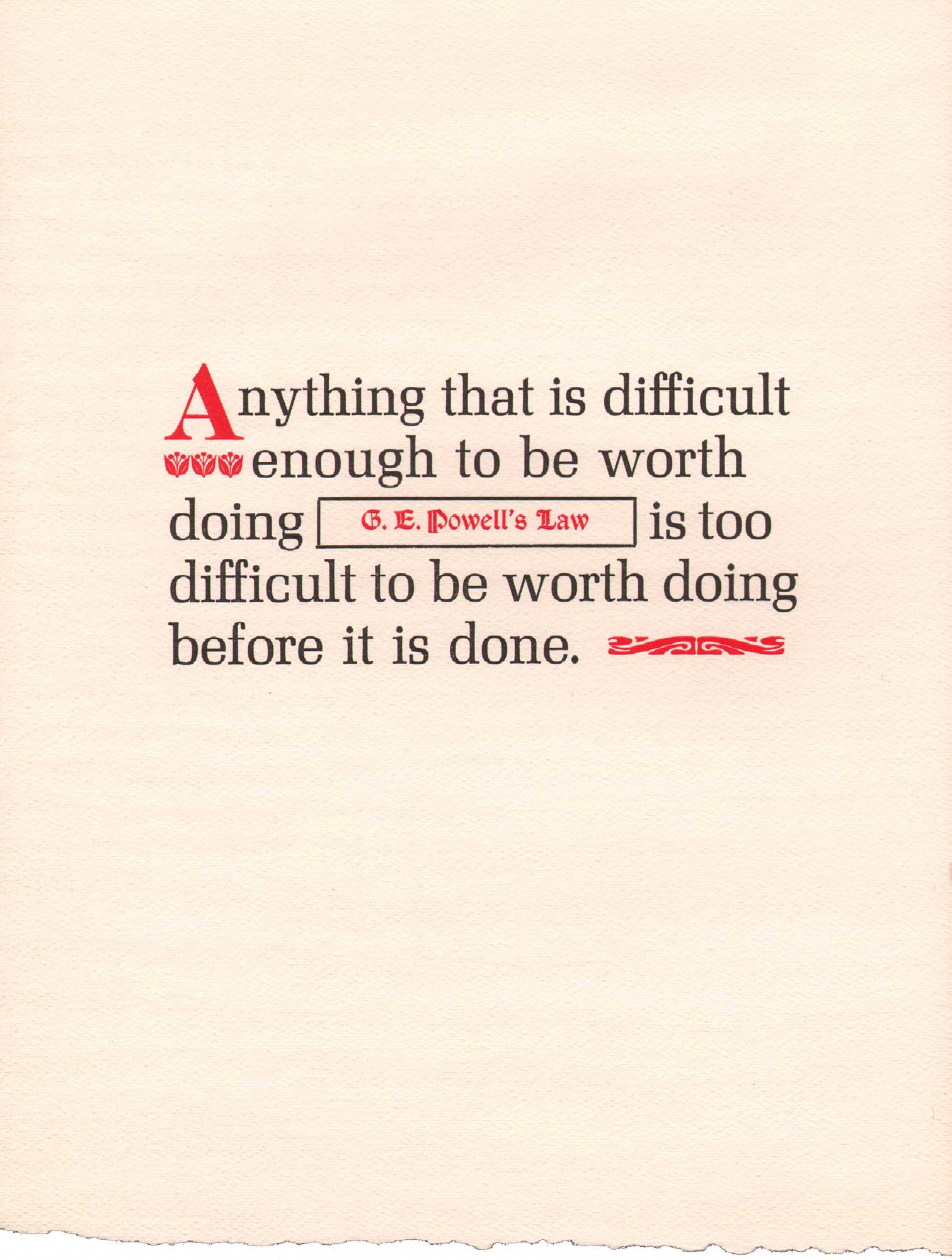
Making our way to poetry, this syllogistic broadside contains a few words of wisdom. While I envision the three previous examples in public places, I imagine Powell’s Law in a semipublic space, such as the teacher’s lounge at school, bookstore, or mechanics’ shop. Perhaps because it is substantially smaller in size than the others, it seems better suited to an indoor than outdoor environment. Its message is not decidedly political, although it is persuasive, and where German Picnic and What Makes Bad Printing Good correspond to events, Powell’s Law is timeless (and ephemeral at the same time!) I particularly like the way the sentence is broken into two units.
2. TYPOGRAPHIC POETRY
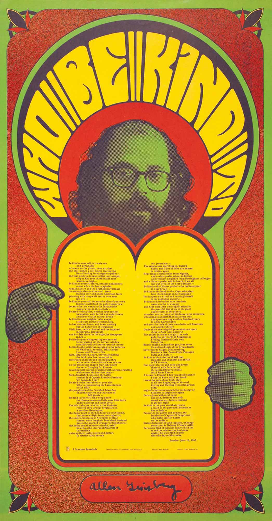
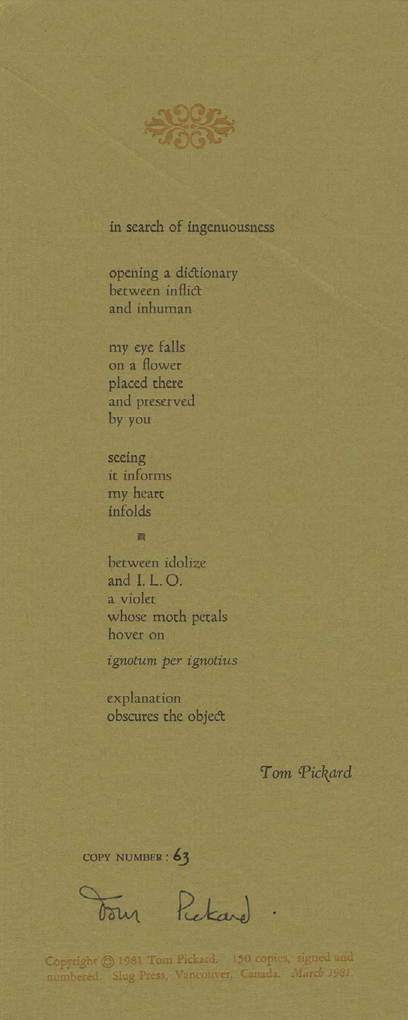
With the possible exception of ‘sound poetry’ (‘does it still exists?’ — Clark Coolidge) and that of oral cultures, all poetry is visual, so the designation ‘visual poetry’ has never made much sense to me. Likewise, poetry doesn’t have to be ‘concrete’ to be typographic—in fact, there are plenty of concrete poems that aren’t typographic at all, while poems we ‘see’ subconsciously every day in conventional formats such as classroom anthologies and standard trade editions are ‘visual’ even if the poetic form isn’t illustrative or pictorial. Reading is a way of seeing. In surveying these broadsides, I’ve noticed that few have literal illustrations, pictures that show what the poem is about, as we see in most children’s books, advertisements, and newspapers. Printer’s ornaments and devices add visual elements to a poem, but as in the example above, British poet Tom Pickard’s ‘In Search of Ingenuousness’ published by Peter Quartermain’s Slug Press in 1981, don’t quite take the broadside out of the realm of typographic poetry. The selection of a particular paper or typeface can be illustrative, or at least suggestive, but in my opinion there are no strict guidelines for finding the best typeface for a particular poem. There are historical periods to consider, allusions and referents, as well as technical and material limitations, like having enough of a particular sort to set an entire poem, or a bed wide enough to accommodate exceeding long lines, like those of Walt Whitman or Allen Ginsberg.
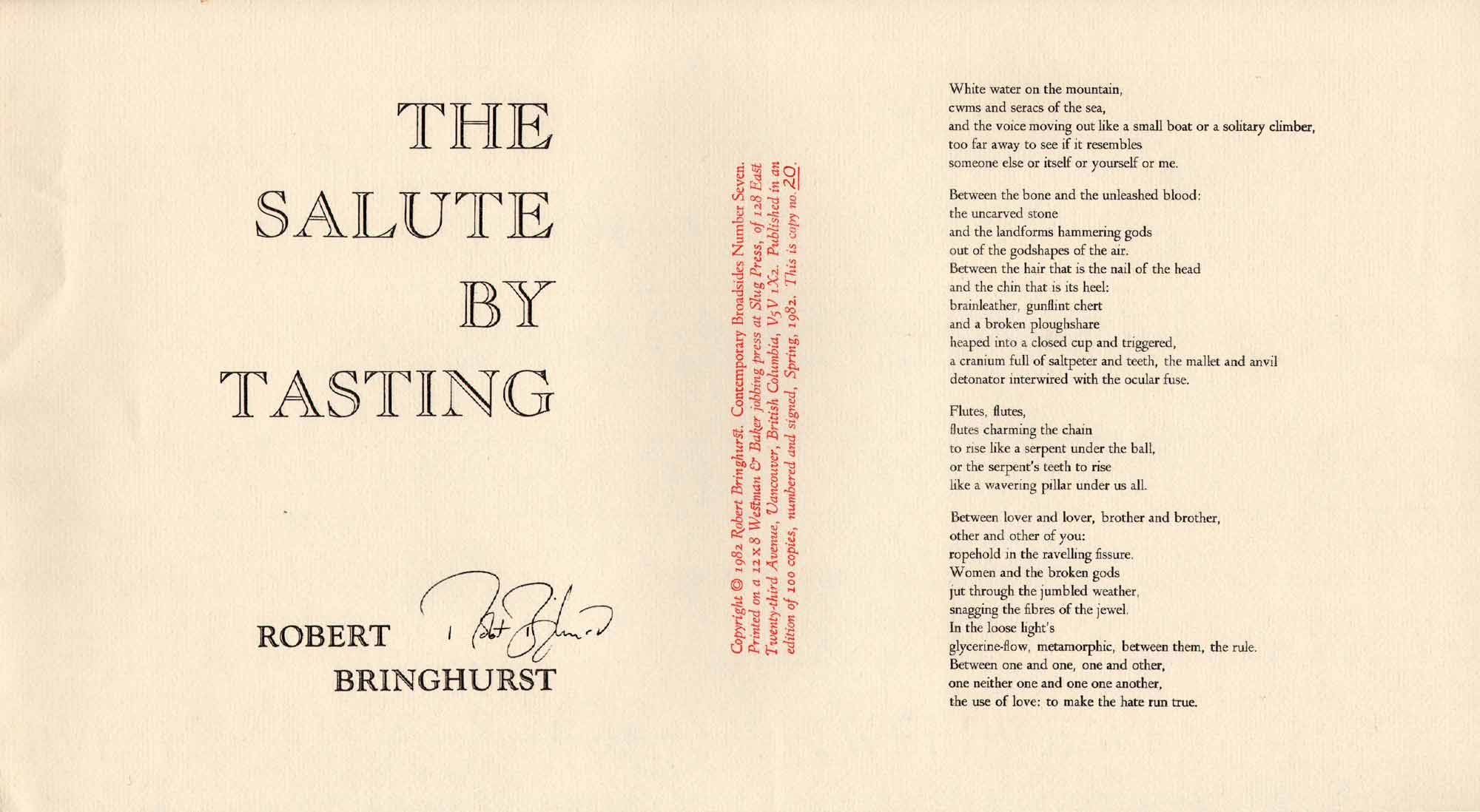
Since I mentioned Bringhurst’s ‘typographer’s bible’ and the two previous broadsides are from Slug Press in Vancouver, I thought I should also show an example of Bringhurst’s poetry printed by Quartermain. Here’s The Salute By Tasting, a handsome oblong broadside with the colophon (printed in red) dividing the display type on the left from the poem on the right. The title and poem are both set flush toward the center, a thoughtful re-organization of the more traditional format we’ll see in the next example, where the portrait (as opposed to ‘landscape’ format seen here) has the title at the top, colophon at the bottom, and poem sandwiched in between. We’re not going to get into the question of how a typographic authority such as Bringhurst gets printed, but I should mention that when someone with strong opinions about art and design has their work printed by someone else, interesting conversation can arise. We could also talk about the poets who know nothing about books or typography, but who have very particular ideas about how their books should look, but that’s also a subject for another time. Translating words into space, feelings into letterforms, is a significant part of book design.
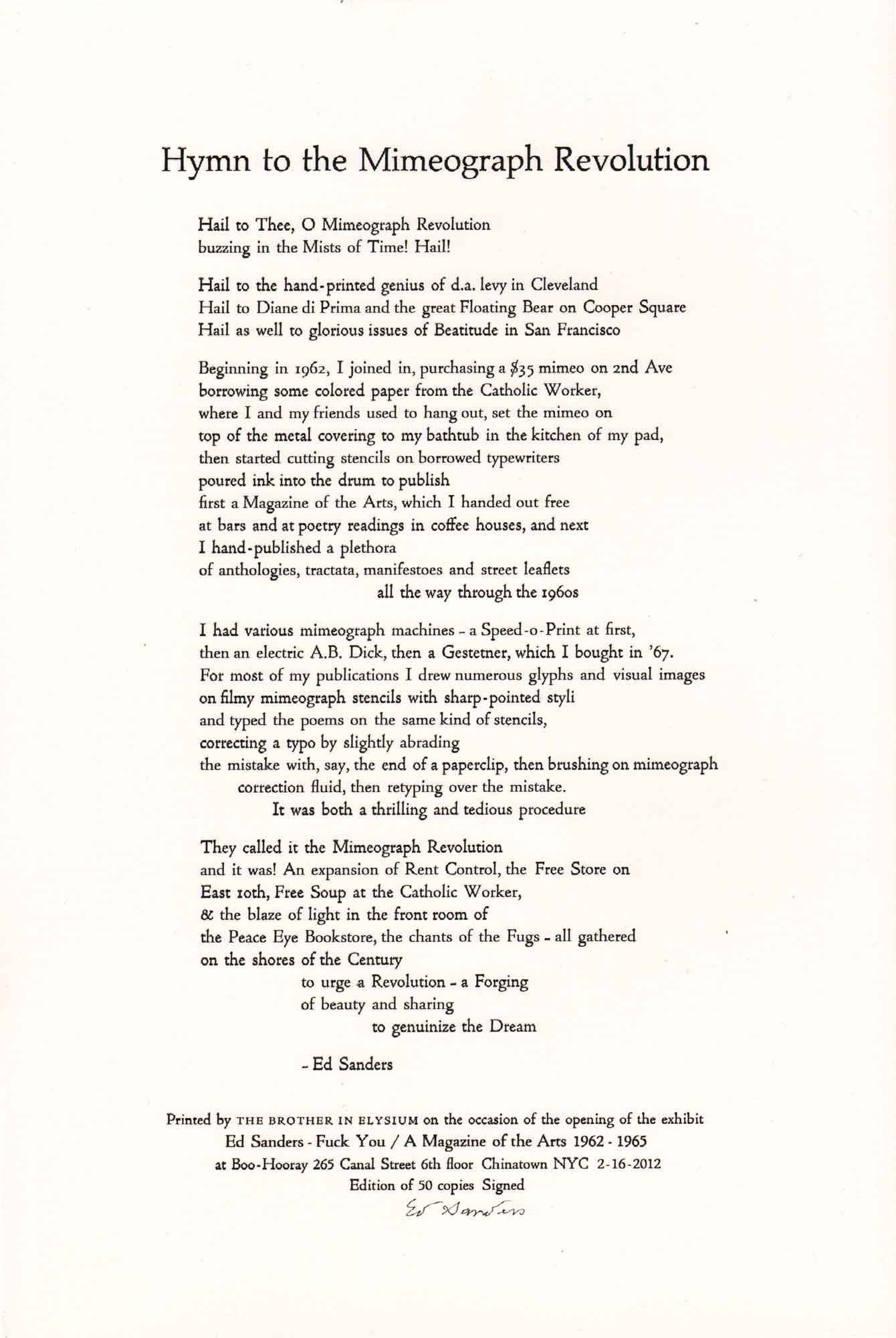
Poet and human rights activist Ed Sanders knew what Amos Kennedy meant by ‘What Makes Bad Printing Good’ as did the other writers and publishers he salutes in this poem, ‘Hymn of the Mimeograph Revolution,’ including the Cleveland-based mimeo maverick d.a. levy, as well as and Diane di Prima, who co-edited the great mimeo magazine Floating Bear (1961-71) with LeRoi Jones. These were pioneers of the ‘dirty mimeo’ movement, one that included letterpress and mimeographs, and later the zine photocopy culture. In other words, the mimeo movement was not united by a particular tool for textual reproduction so much as a shared involvement in poetics. It could argued that the mimeo medium itself didn’t mean as much at the time as it does in hindsight—it was just a simple, affordable machine that helped get the word out quickly; from poetry magazines to leaflets for demonstrations to civil rights pamphlets, the mimeograph was there. Like democratic multiples, these documents have become fetishized collector’s items, and as this colophon states, exhibited in reputable New York art galleries.
3. INTEGRATING DISPLAY TYPE
Display type is one of the primary ingredients in the printed poem, and broadsides allow the printer to experiment with these large letters in a way that is less restrictive than the book form. Display type is generally considered 36 points or larger, and woodtype looks ravishing on broadsides, the bigger the better. Some fonts work better for continuous reading than others, so the poetry broadside is generally less restrictive than a long work of prose. In turn, some fonts are designed for display only, but can work well for setting short poems on a single sheet. Medium, scale, audience, legibility, and the relationship between the display font and the rest of the broadside are important factors to consider during composition. Display fonts can look great with or without images, and in some cases, display type can be so prominent and striking that there is no need for any additional imagery.
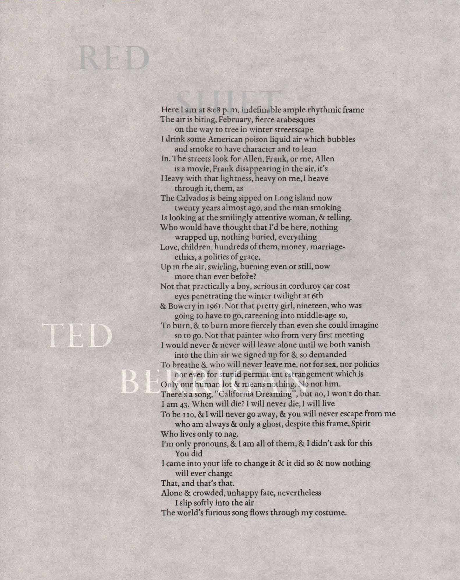
This is an excellent illustration of why letterpress doesn’t always reproduce well digitally—it also shows what letterpress can do that an inkjet printer can’t. This poem was printed on translucent vellum with the primary text in black and the title and author’s name in silver. They are subtle, but the shimmer under the right light and the chameleon-like background makes this a dynamic work of art, one that I would actually resist framing. The poem is true to the original in its setting, clear and legible, which strikes me as a responsible decision given that the author is deceased and proper permissions were not sought prior to printing. It was printed in a small edition, at Oregon College of Arts and Crafts as I recall, as a gift for the printer’s girlfriend. The penultimate line reads: “I’m only pronouns, & I am all of them, & I didn’t ask for this / You did / I came into your life to change it & it did so & now nothing / will ever change / That, and that’s that.” According to some of Berrigan’s former students, copying poems was one of his favorite assignments: go home and type up this poem and see if you can get into the author’s head. Copying, typing, and typesetting are all ways of embodying the poem, of understanding writing differently.
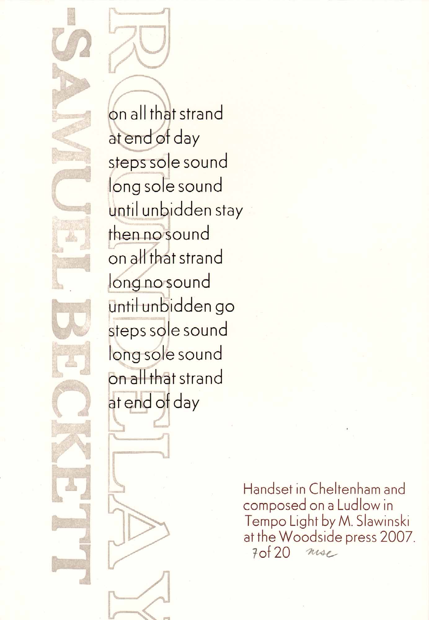
Sorry that the Y was clipped from this broadside, but the kerning between it and the A is terrible anyway! Adjusting the distance been the Y and the A would have involved physically, and irrevocably, cutting down the type, and since the printer, in this case, did not own the type, his options were limited. Working with large display type, there’s no way for poorly kerned letters to go unnoticed. A former co-worker of mine printed this on a slow afternoon during my short stint at Woodside Press in the Navy Yard. I love the rhythm and repetition in this poem, the play of letters and sound, ‘long no sound / until unbidden go / steps sole sound / long sole sound / on all that stand / at end of day.’ This is one of twenty copies printed in three colors on scrap paper from the shop, true ephemera. I’ve included it in this presentation as a transition from purely typographic poetry broadsides to poems and pictures. Here, the display type and the poem overlap, one vertical, the other horizontal, creating a nice overlapping texture that has a visual complexity greater than the Bringhurst & Sanders poems we looked at previously. Overlaps and intersections can yield pleasing and often unexpected results on a letterpress.
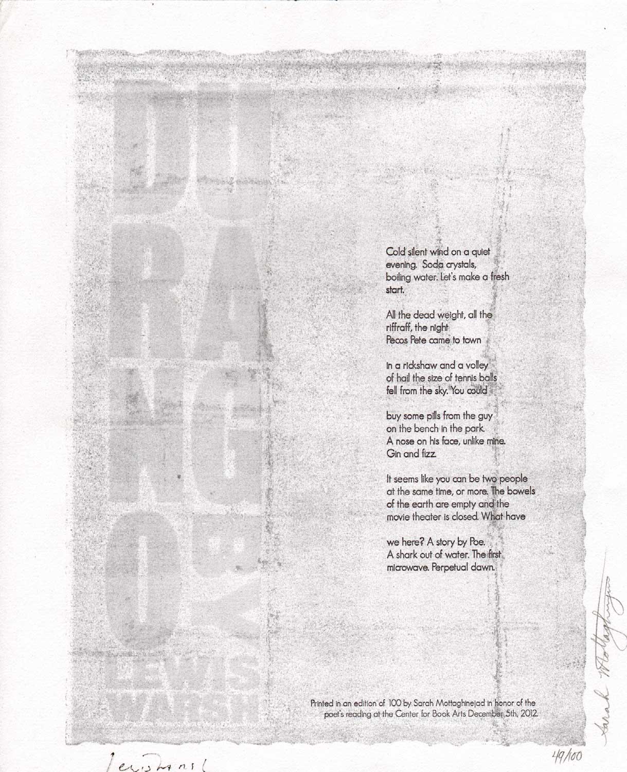
Last year Jed Birmingham and I wrote a complete anecdotal bibliography of Lewis Warsh’s poems, fiction, and autobiographical writings as part of the Mimeo Mimeo feature on his work. ‘Durango,’ published late in 2012, is the first piece that was not included. It was printed by Sarah Mottaghinejad at the Center for Book Arts in New York City on the occasion of the author’s reading in early December. The text and the image do not cross paths as they do in the Beckett piece we just observed, but they are bound by what I presume to be a form of pressure printing that links the embossed display type and the gently inked gray background with the poem in a field of color. While the poem is brilliant, the broadside doesn’t hold my attention because from a distance, the gray background looks rather muddy and muted, so it’s not easy to make out the title because of the faint contrast, and it’s difficult to read the poem on the wall because of the faint contrast and small sans serif type. Still, the display type attempts to balance the poem visually, running in a parallel column on the left, exerting its rather discrete presence as something more than a title. There are just 100 numbered copies signed by both the printer and poet.
4. JUXTAPOSING POEMS & PICTURES
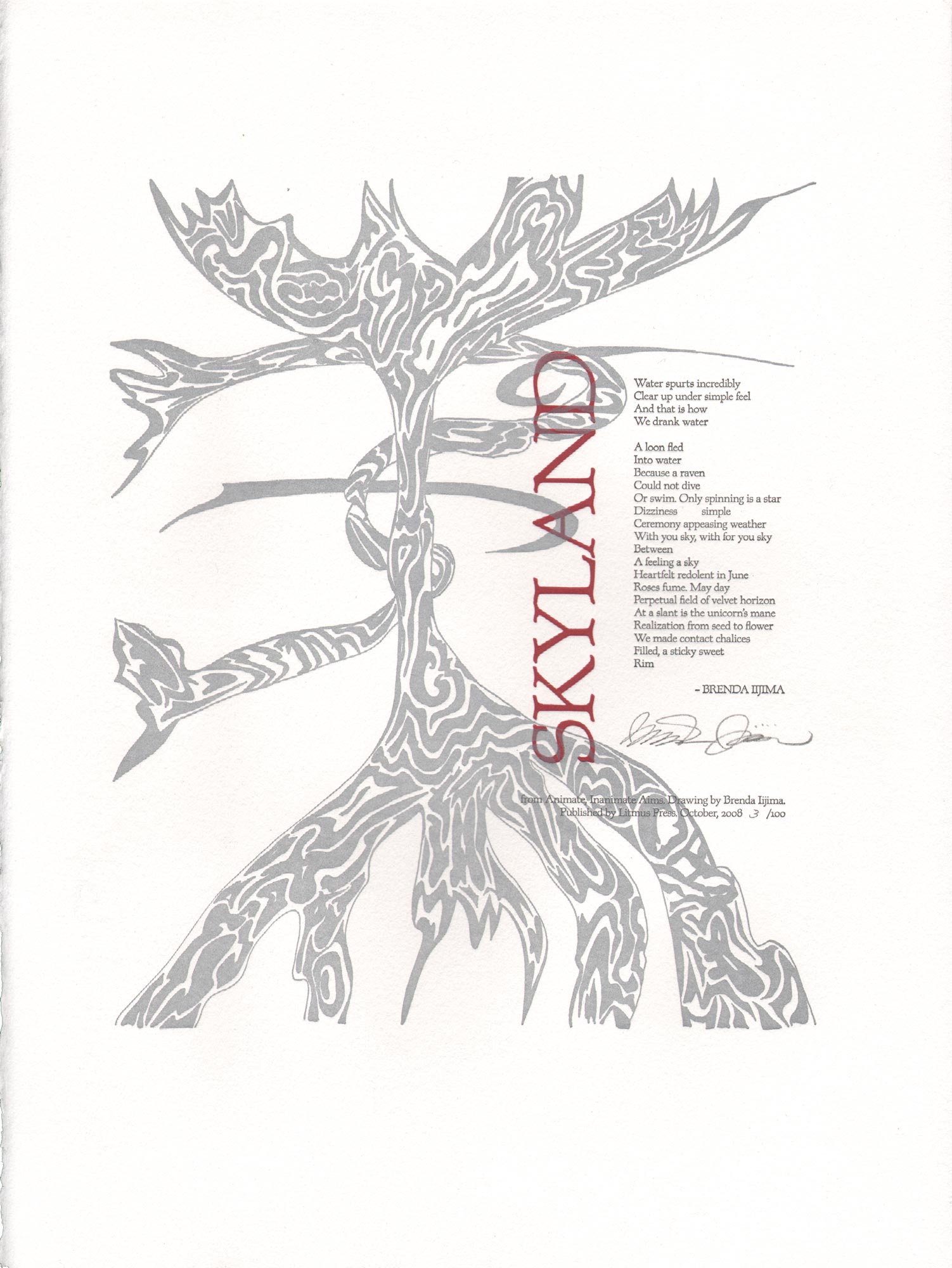
It’s counter-intuitive to create categories, to see things discreetly and present them in a linear order when there is none. This exercise is just a way of gathering examples of some contemporary broadsides in my personal collection and putting them in dialogue with one another. It’s a good way to get away from traditional designations, such as author, illustrator, region, or publisher. It’s random and personal at the same time—were I to present examples from another collection or library, I’m sure everything would be different. The most common ingredients for the contemporary poetry broadside are text and image, which can be arranged any number of ways. Here are a few examples where the image and text balance and engage with one another, but do not integrate or overlap, creating that ‘other element’ that we will see in later examples. It’s worth noting that there are many instances of text and image that contradict, cancel, upset, and interrogate one another that are just as interesting, but unfortunately, not within immediate reach. Some of the broadsides that follow are landscape format with text on one side and image on the other, while others are in portrait format, with the poem above the picture or vice versa. I’ll show three of each, beginning with some examples of the latter. Pictured above, Brenda Iijima’s Skyland with an illustration by the author. Brenda and I printed it at The Arm in Brooklyn in 2008 for Litmus Press.
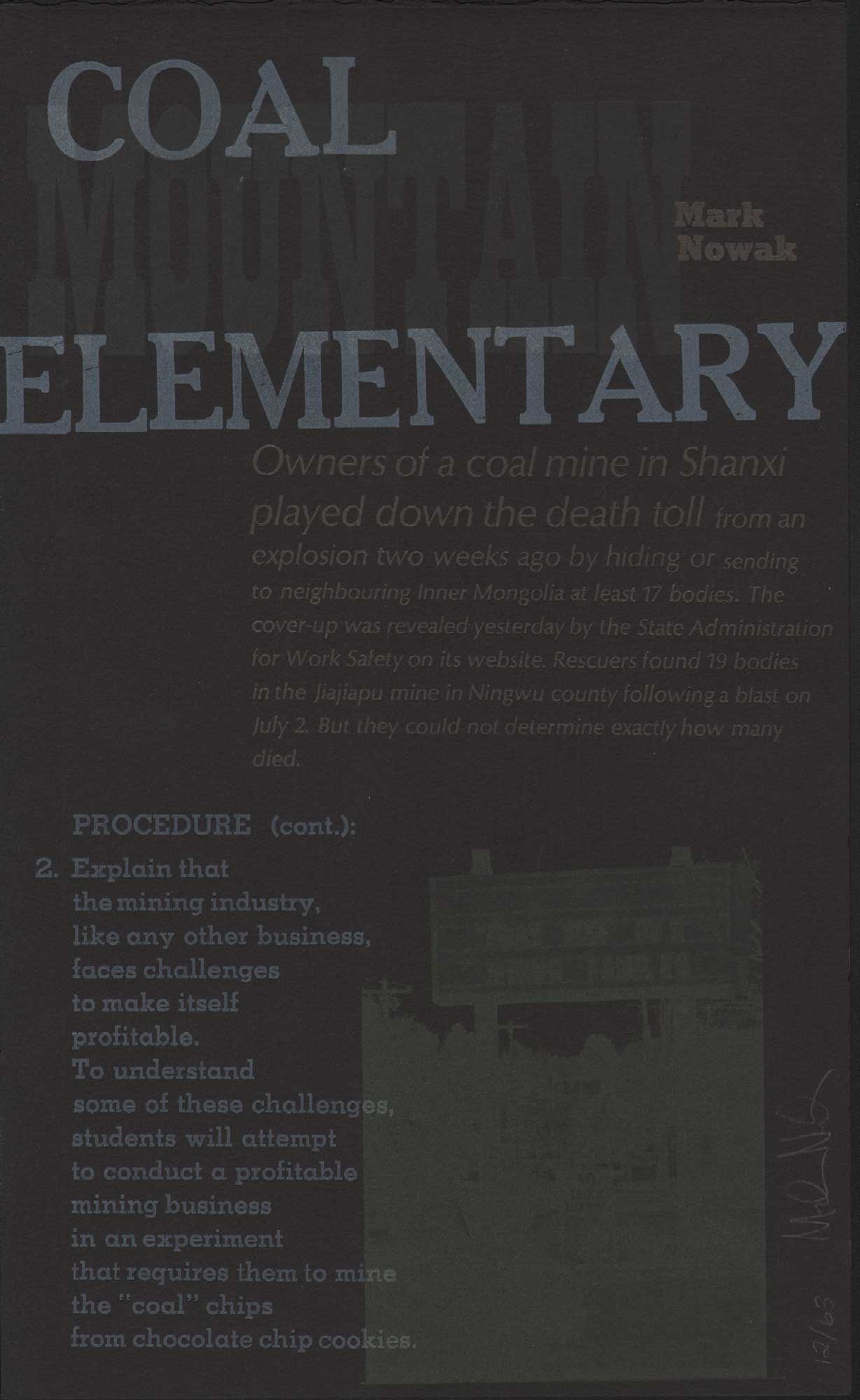
Mining disasters have been making headlines for quite some time, and Mark Nowak’s charged political poem has been printed and persuasively designed by Lara Durback at Mills College in Oakland. The black paper connotes black lung disease, mines, and the coal dust that settles on schoolyards in mining communities. The title and body of the poem are decidedly visual, mixing typefaces and incongruous placement on the page. The image, however, is fairly difficult to decipher—perhaps intentionally so. The text printed in white ink would have popped more with silver on the black paper, while the word ‘Mountain’ in the title is so muted it looks like the poem is called ‘Coal Elementary’ if you’re standing more than an arm’s length from the broadside. Again, perhaps that is part of the printer’s intention—after all, should a poem called Coal Mountain Elementary be conventionally beautiful? It’s a question.
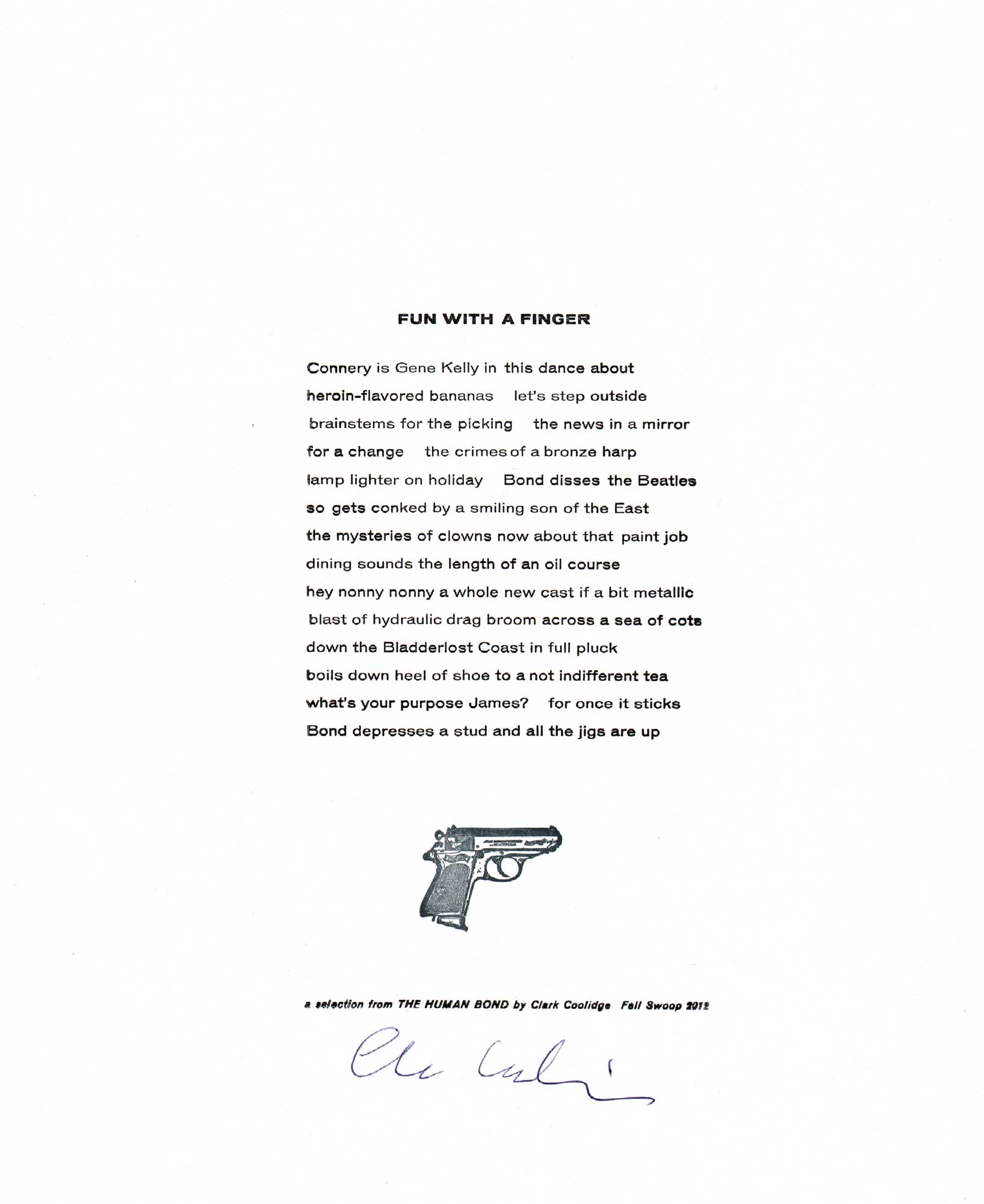
Clark Coolidge has written a lot of long poems, and excerpts from longer works presented in the form of a broadside have a way of channeling the reader’s attention, bringing out the details and nuances. Excerpts presented in periodicals can do something similar, but they serve more as sample than a complete work. In a broadside, an except can be displaced from the whole work and become its own whole, working on terms other than, but related to the larger body. In this case, the poem has been excerpted from a longer poem or manuscript titled ‘The Human Bond’ which takes 007 as its subject: ‘Connery is Gene Kelly in this dance about / heroin-flavored bananas.’ The double-space after ‘bananas’ could stand for a period to complete the sentence plus a space, to begin the next, although only proper names get capitalized and the only closing punctuation mark comes at the end of a question: ‘what’s your purpose James?’ The title, image, and colophon are all centered. The text is a little on the small side, or the sheet a little too large; either way, an excess of white space in my opinion. I like the way the shape of the ragged right lines mimic the shape of the pistol. Although not called for, this copy was signed by the author.
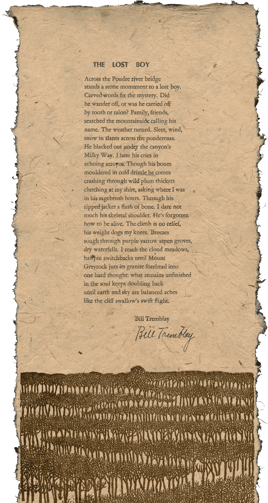
The vivid colors in this illustration are alluring, as is the way the poem rests in the image below. The poem was set by hand in metal type and the images were made with Print Gocco, a simple screen print kit for children and crafts people. Published by Colorado State University’s Bonfire Press at the Center for Literary Publishing, home of the Colorado Review and a fire engine-red Vandercook SP-15.
Most of the examples I've shown so far use fairly conventional paper, but here's one printed on banana leaf with attractive deckles on four sides (sorry the one on the bottom got cropped off in the scanner). The paper is warm, and the texture and threads create an intriguing interaction with the picture's pattern.
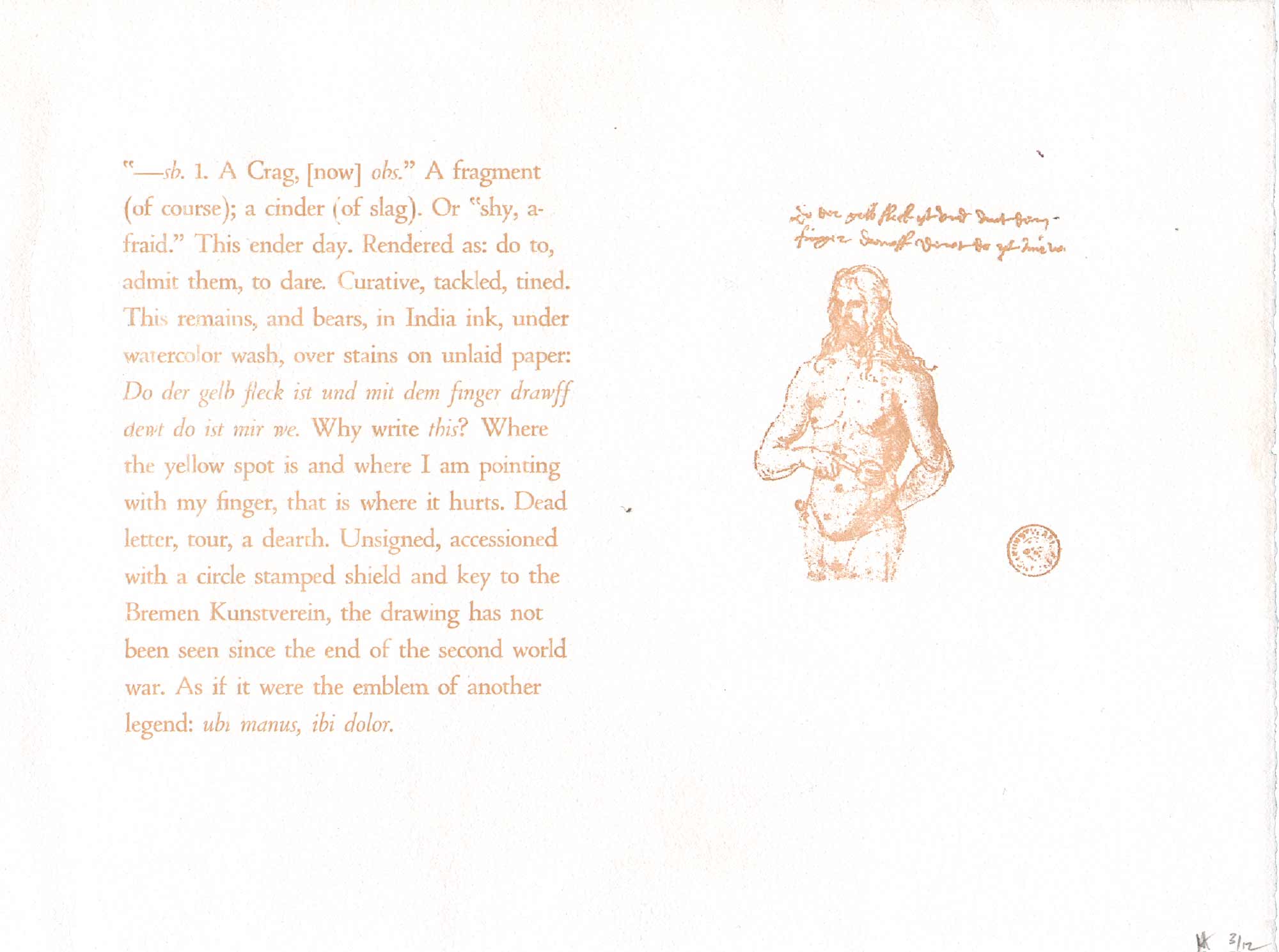
This is also an excerpt from a longer poem, book-length actually, by Craig Dworkin that I published in 2004 titled Dure. The illustration on the right is a self-portrait that the sixteenth century German printmaker Albrecht Dürer sent to his doctor shortly before his death, apparently in search of a diagnosis. The drawing is accompanied by a note that translates: ‘Where the yellow spot is, and where I am pointing, that is where it hurts.’ This letter became a point of departure for Dworkin’s poem, and here we have the text from the first page of the book opposite with the drawing. I like the illustration in copper ink, but think that it could be at least twice as large as it looks a bit understated next to the rather large text. The printing is quite good, but a darker ink or darker paper would have made it easier to read at a distance.
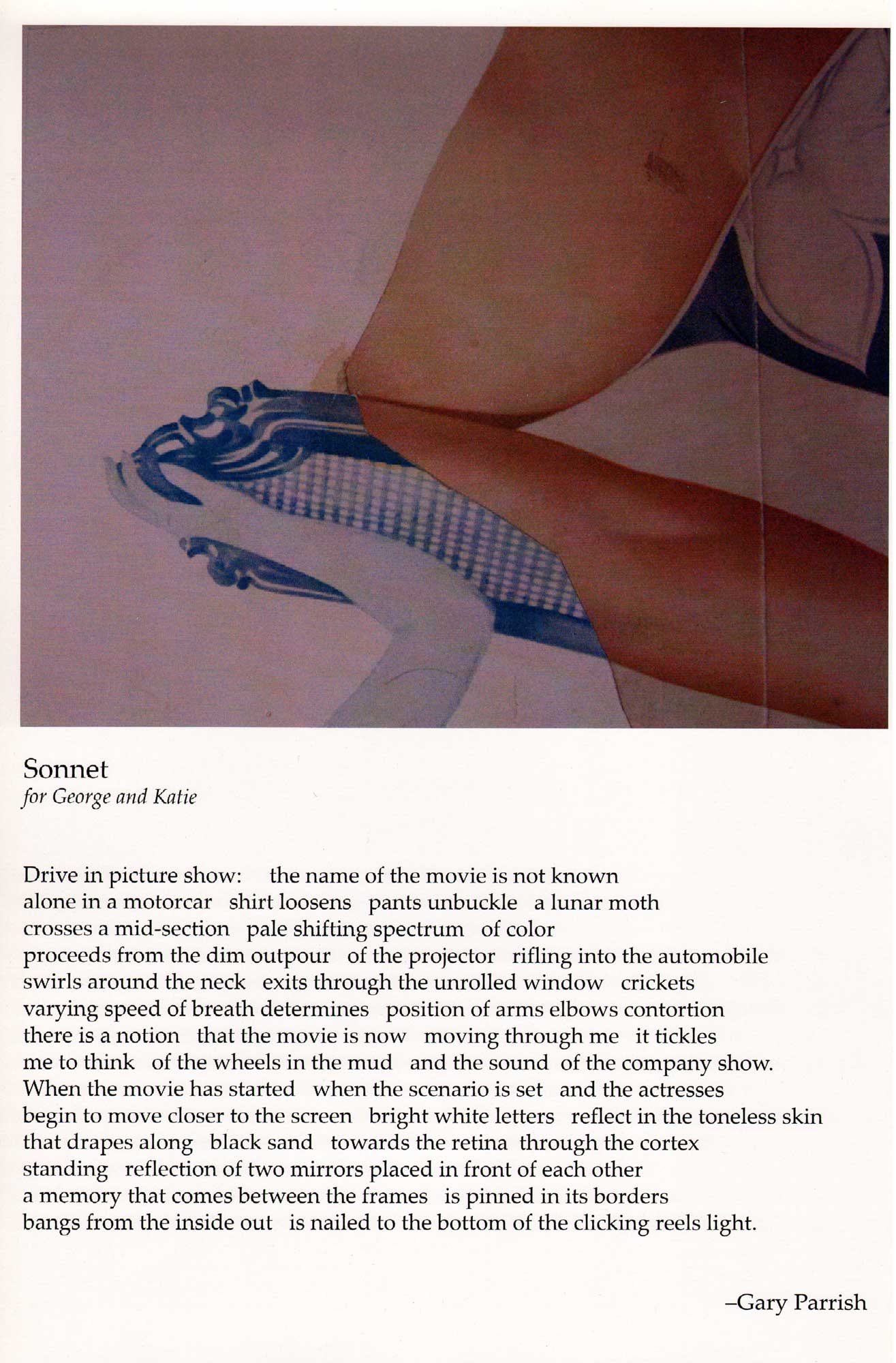
This series of twenty-four broadsides was produced in conjunction with the Bowery Poetry Club. Each features a work of art by George Schneeman, a Lower East Side artist who has collaborated on hundreds of projects with poets, ranging from unique one-of-a-kind books to large-format portraits of poets, to collaborative paintings, collages, drawings, and more. The author of this poem is also the publisher, and the poem is dedicated to Schneeman and his wife Katie. The broadsides in this series are all similar in their format and dimensions, and for some reason, all of the images appear a bit muddy, oversaturated, or just a little out of focus, which is a shame as it’s a lovely collection of poets and another great example of Schneemen’s inimitable greatness and generosity. This is the first broadside I’ve shown that was printed digitally—everything else is letterpress. The works of Schneeman’s I’ve seen in this series are full color collages, so letterpress would not have been an ideal form of reproduction.
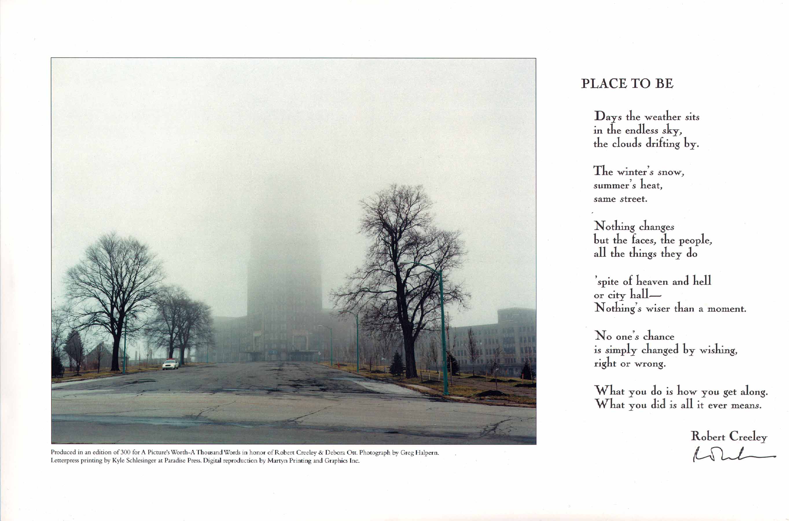
Like the last example, this broadside is also printed on commercial tabloid size paper, and it’s the first example of a broadside in this presentation that uses photography. The building behind the fog is an abandoned train station in Buffalo, a city which was home to the poet Robert Creeley and the photographer Greg Halpern. In terms of its size and architectural integrity, the station is often compared to Grand Central in New York, and Creeley used to enjoy taking guest from out of town there for a glimpse of all its faded glory. Just Buffalo Literary Center commissioned me to print and design the broadside for them, and for some reason I ran the poem through the letterpress and had the image printed offset, so it would have been much easier to simply proof the poem or set it digitally than to have printed the entire edition of 300 by hand, but like the signature of the poet, the handprinted poem can sometimes lend a certain authenticity to a broadside. And the experience of printing it at Paradise Press with some crisp Cochin was memorable.
5. HANDBILLS, FOLIOS, POSTERS & BROADSIDES?
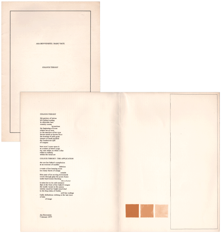
Good question, but there's no good answer. It's an elusive term, but broadsides are usually bigger than handbills and smaller than posters. They are often printed letterpress, but not necessarily. They often contain verse, but that's not a requirement either. Like pamphlets, some broadsides fold, but that's just my opinion, others would say that broadsides are a single, unfolded sheet printed on one side only. Here are a few alternative formats. This picture of Asa Benveniste and Marc Vaux's collaboration 'Color Theory' (1977) does not do the work justice.
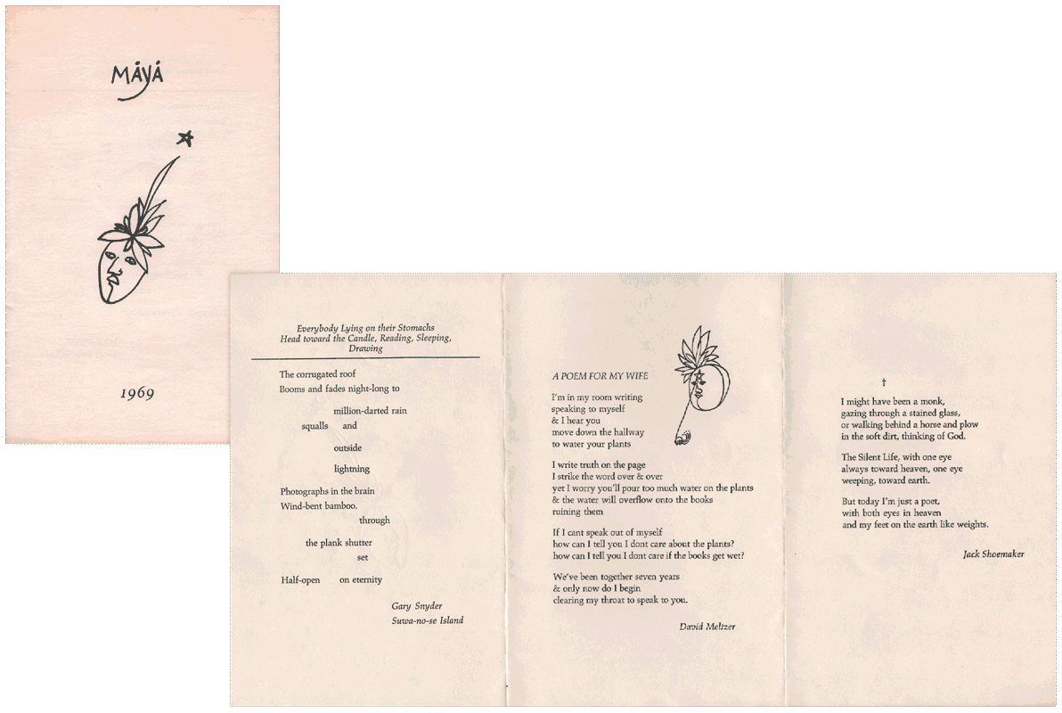
These nifty ‘pamphlets’ were printed in an edition of 1,000 for the Santa Barbara Poetry Festival in April 1969 by Clifford Burke at Cranium Press in San Francisco and distributed for free. For those of you who are new to letterpress, Burke’s Printing Poetry is one book that I recommend highly, as well as Printing It, which was an influential guide to DIY publishing in the 1960s. Maya contains two drawings by David Meltzer and on the back, an advertisement for Maya Broadsides, Quartos, and Books. So is it advertising? Yes. Is it a pamphlet? Yes. Is it a broadside? That’s up to you, but I had this copy framed and displayed open in my office for years.
Who could resist Robert Kelly in Kelly Green? Some might suggest that this looks more like a greeting card than a broadside. The sheets folds up, so the portion of the broadside with the image disappears, leaving only the author's name and the two poems. I like the photograph, and always wanted there to be a way to display the poem and the picture simultaneously, but in this instance, it's an either/or.
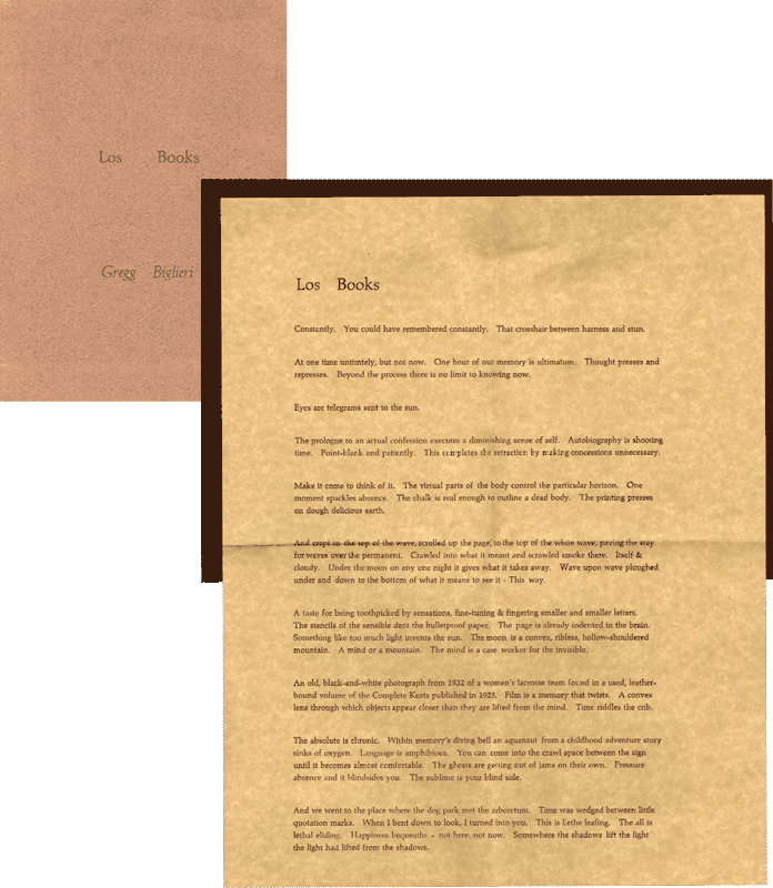
I got the idea for this quarto glued into a simple folder from Charles Olson’s ‘Letter for Melville 1951’ printed at Black Mountain College, although I suspect the format must pre-date the twentieth century. David Abel in Portland recently gave me a poem called Printingway by Alan Brilliant that has a more refined design with the quarto affixed to the recto of the open folio only. The well-printed verso is numbered and signed by the author. It also opens bottom to top, right to left, unlike ‘Los Books’ and ‘Letter for Melville 1951.’
6. ANOTHER PERSPECTIVE (ON THE PROSPECTUS)
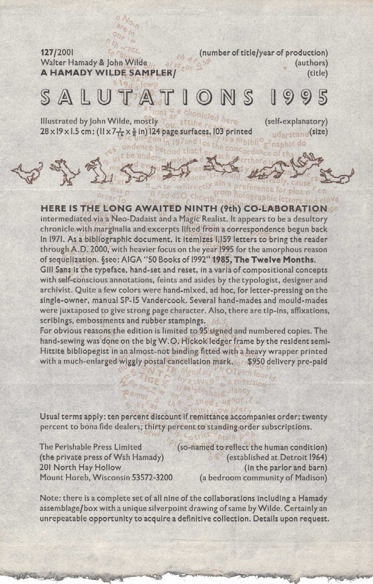
The term ‘prospectus’ dates back to the early 1700s, and its etymology is related to ‘prospect,’ the act or fact of looking forward or out. I’d be curious if there are any earlier examples of prospectus known by another, or no name. The prospectus is a statement of aims or objectives, and in the private press tradition, publishers will often use the prospectus to advertise and describe a forthcoming publication, solicit subscriptions, gauge interest, and offer a prepublication discount. The prospectus can be artfully produced, often printed in a manner similar to the book it promotes; for instance it is common to use the same paper, type, illustrations, and an excerpt from the book. There is a lot to be learned from the prospectus (especially when all doesn’t go according to plan in the pressroom!) and they make nice keepsakes unto themselves, much better than email, which some publishers find more cost-effective and convenient these days. Here’s a playful, single sheet from Walter Hamady’s Perishable Press from 2001 announcing the publication of his collaboration with John Wilde entitled Salutations 1995.
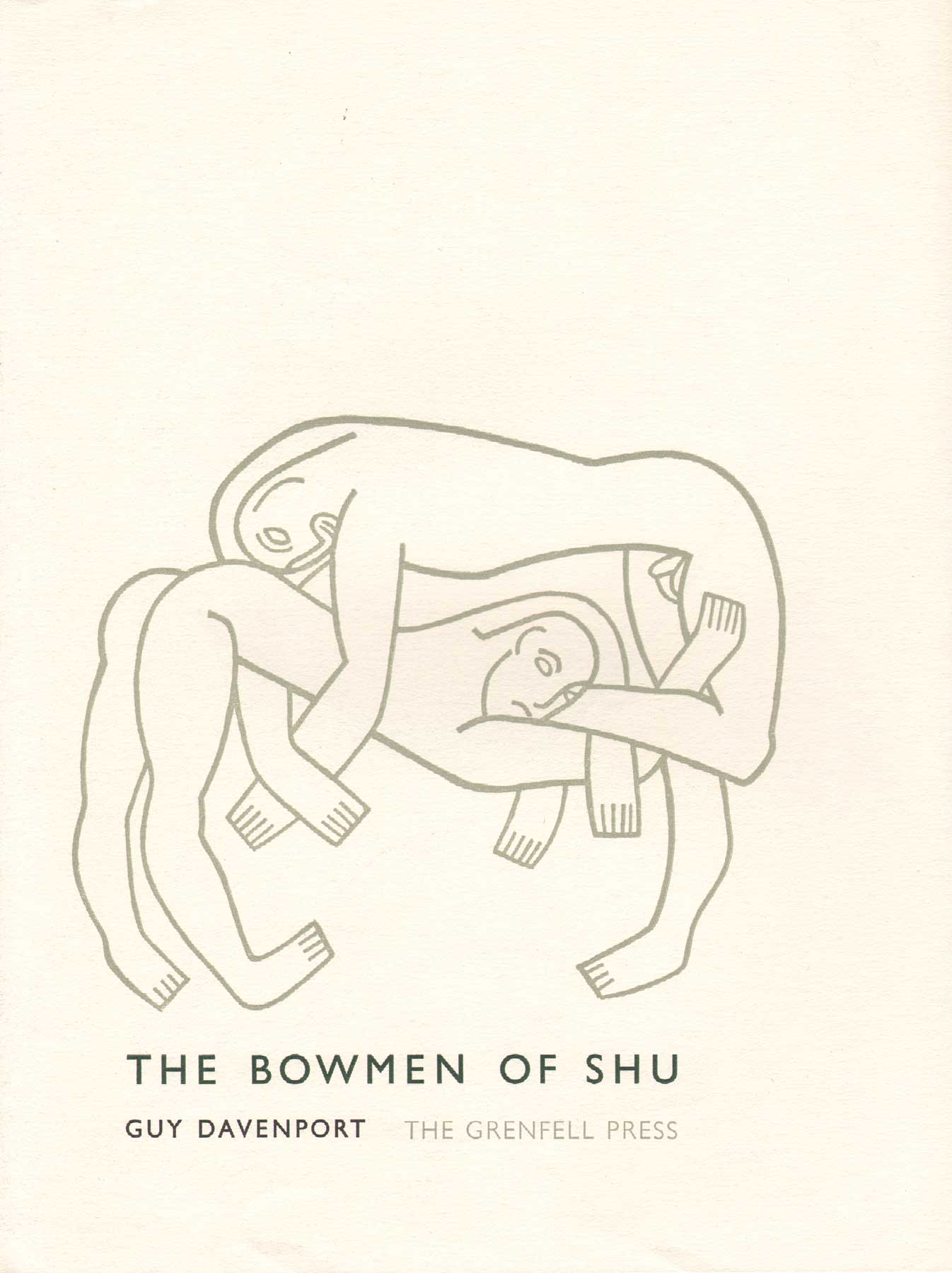
The Grenfell Press was established in 1979 by Leslie Miller, and it is one of the private presses I like most because the writing tends towards substantive, innovative, contemporary poets, including Robert Duncan, William Gass, John Hawkes, Susan Howe, Ann Lauterbach, Harry Mathews and others. The roster of artists is also quite impressive, including R.B. Kitaj, Robert Mangold, Brice Marden, Kiki Smith, Richard Tuttle, and Trevor Winkfield. These are artists who read and understand poetry. Many private presses are far less adventurous in commissioning art and writing.
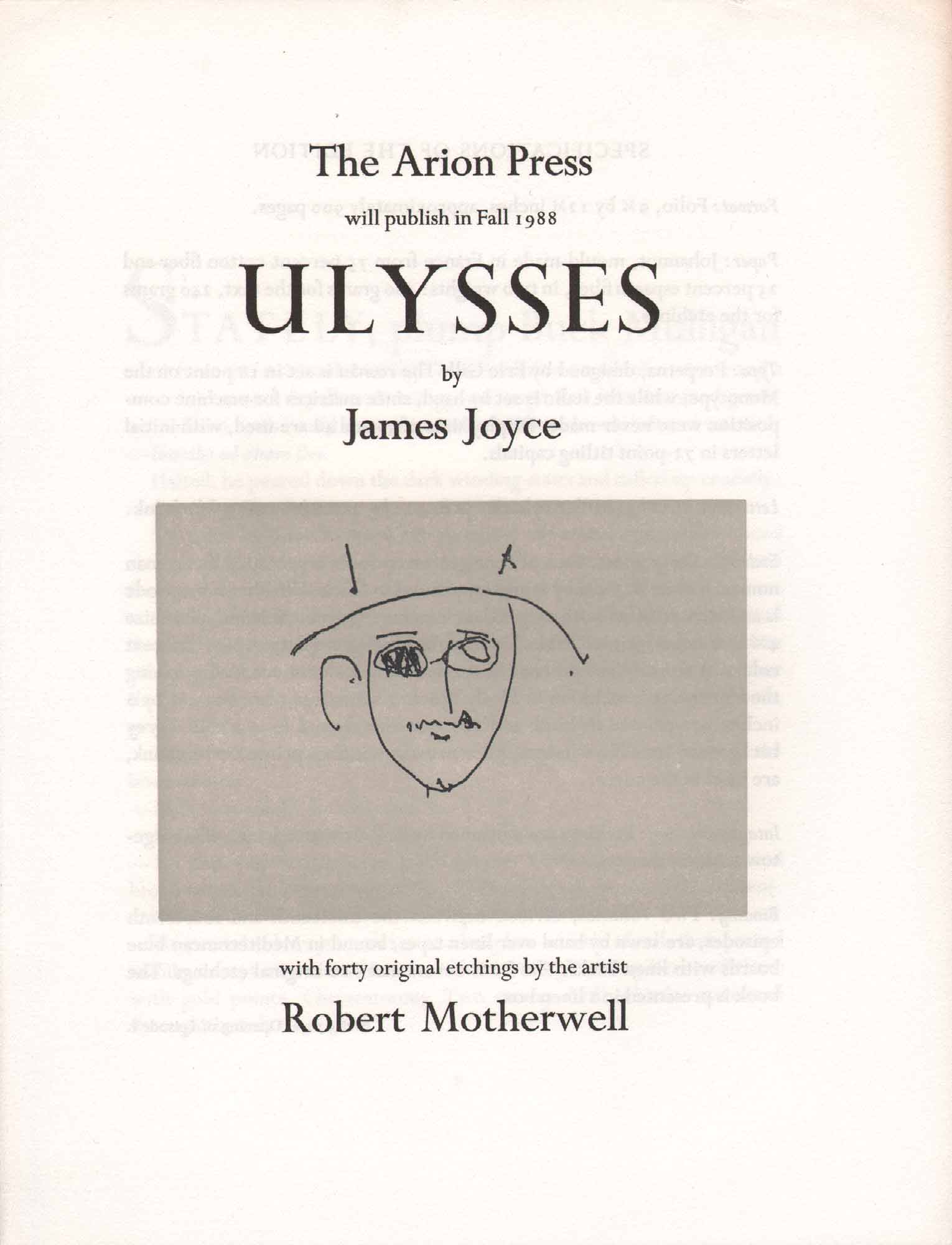
After apprenticing with Dave Haselwood and the Grabhorn Brothers, Andrew Hoyem started Arion Press in San Francisco in 1974. Here’s a prospectus for a $7,500 edition of Ulysses with etchings by Robert Motherwell (prints available for an extra $20,000). These extravagant editions are hatched from an ideology similar to what William Morris expressed in his writings on the Ideal Book and through his Kelmscott Press. Although innovative unto themselves, Motherwell and Joyce are canonical in the art and literary worlds. Ulysses was a safe investment for Hoyem. Arion Press books are for rich people and well-endowed institutions. Unlike the broadside, they do little to nourish or stimulate the public mind, and like Kelmscott books, few are actually designed with readers in mind.
Here’s a hilarious prospectus for the prospectus of a forthcoming book from Aryan Press, a spoof on Arion Press’ prospectus for Moby-Dick. This prospectus describes the format of the prospectus as: ‘Carefully preserving the layout of every preceding fine press edition, guaranteed to fulfill the expectations of even the most antiquated bibliophile.’ The edition (again referring to the prospectus itself) is, ‘a genuine Collectors’ Item, a bona fido hedge against inflation at the special lowlow investors’ introductory price of 999.95. Optional are detachable kid gloves for 87.50 [Specify S M or L]. THE PROSPECTUS will be available shortly. Ask your broker to countersign the Purchase Supplication.’
I found this at Serendipity Books with the phony Aryan Press prospectus. I wouldn’t call this a broadside, but it’s another humorous spoof on marketing poetry, in this case, Poltroon’s Transitional Face Series, advancing ‘great insignificant works of twentieth century literature.’ This handbill boasts, ‘Usually suppressed or given away, we are pleased to offer pre-remaindered copies at the following inflated prices:’ I love the way the C caresses the pilot’s face, and how the gummy quadrilateral makes the text describing the books as ‘characterized by feeble editing, bad presswork, monotonous formats, and half-witted design and typography’ nearly illegible.
7. INTEGRATING IMAGES
I’m using the term ‘integrated images’ to describe moments when the text and image are not the same (as in concrete poetry, where the word ‘apple’ is shaped like an apple) but rather entities that somehow touch or overlap. This proximity is distinct from the examples we saw earlier of text and image that have a consciously constructed distance between them, or display type that mingles with the body of the poem. These overlaps and intersections between text and image are often beautiful when examined in detail as they show us new things about letterforms as images and images as letterforms.
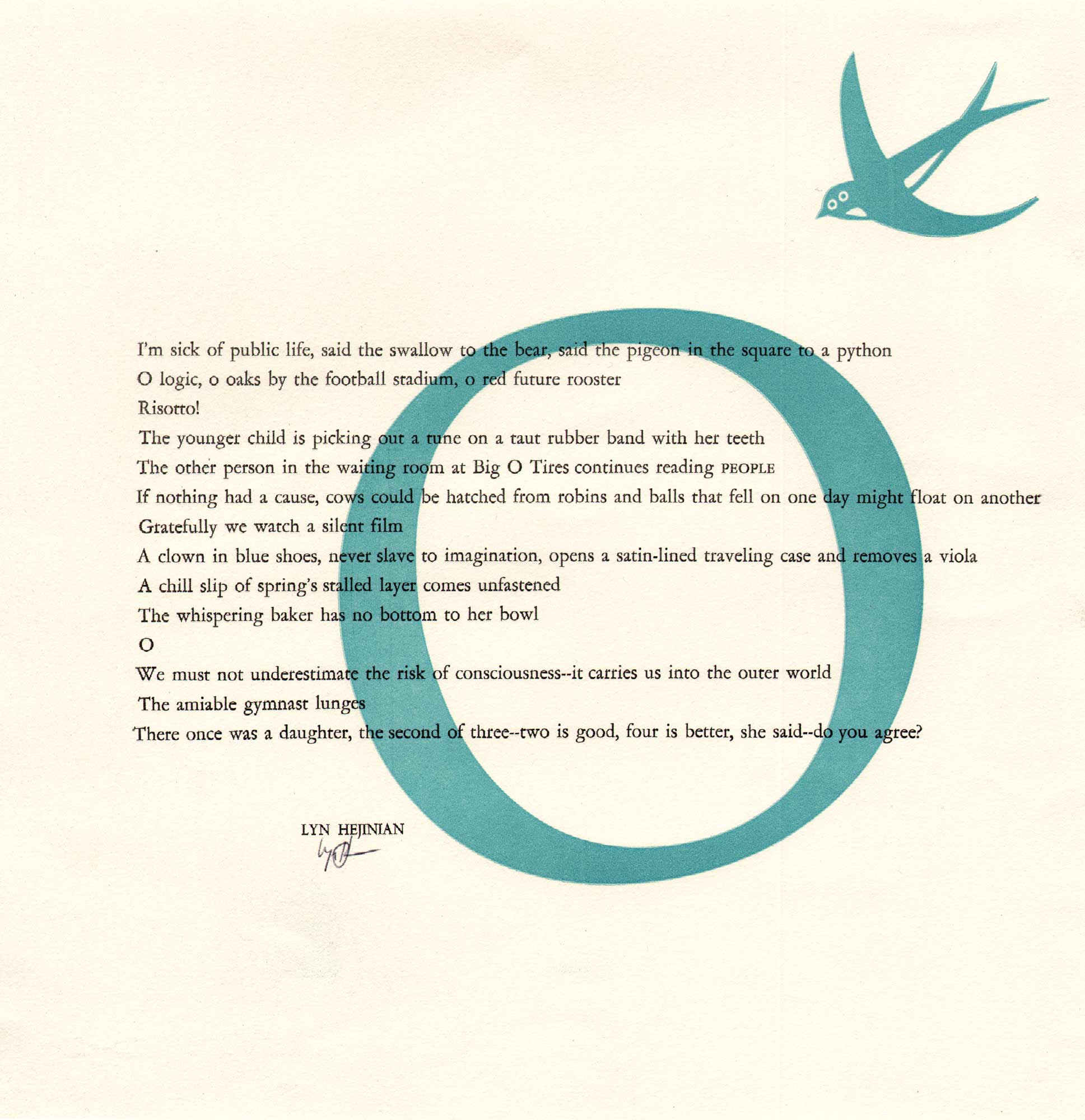
Typography and simple imagery: a bird about to pass through the big O in the poem:
O logic, o oaks by the football stadium, o red future rooster Risotto!
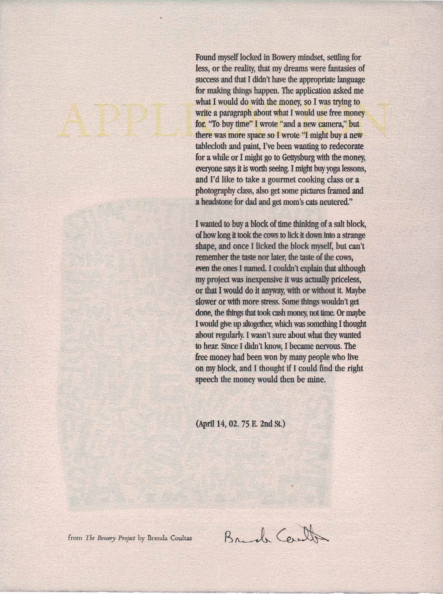
Here’s an excerpt from Coultas’ The Bowery Project, dated April 14, 2002.
The application asked me what I would do with the money, so I was trying to write a paragraph about what I would use free money for. ‘To buy time’ I wrote ‘and a new camera,’ but there was more space so I wrote ‘I might buy a new tablecloth and paint, I’ve been wanting to redecorate for a while or I might go to Gettysburg with the money, everyone says it is worth seeing
It’s a journalistic poem titled ‘Application’ the title faintly displayed behind the first strophe. The image is equally faint, a collage of words it seems but difficult to discern even under bright light, but nevertheless, adding just a hit of texture and contrast to a poem that stands well on its own.
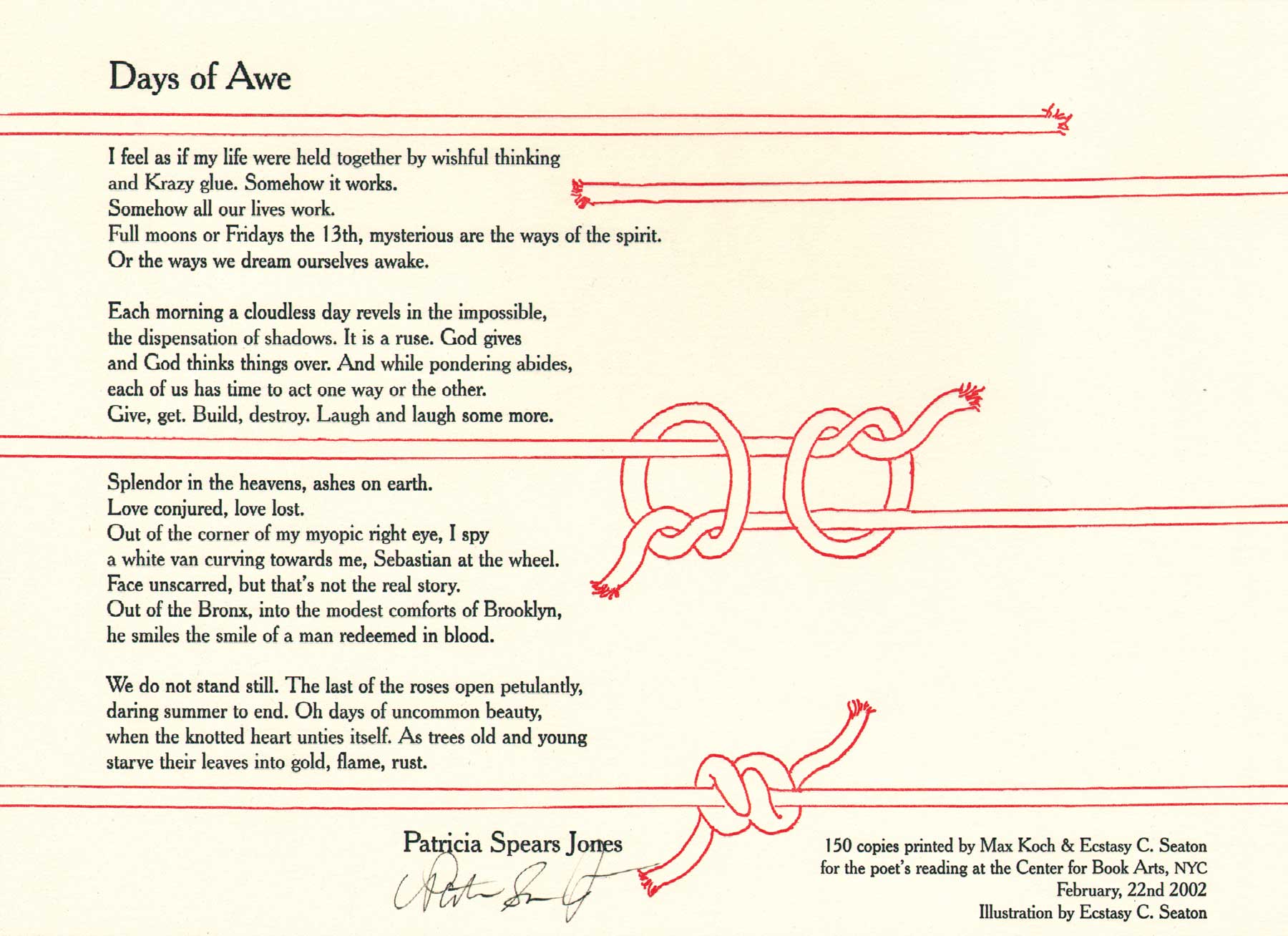
Lines of poetry and lines of string are thoughtfully integrated, although they do not overlap or touch. The traditional black and red printer’s pallet looks refreshing and bright, a nice example of a landscape format that uses clean ‘line’ imagery to create a dynamic broadside worthy of precious wall space. I also like the fact that the image bleeds, giving it a continuous and abstract sensibility that calls attention to the medium.
8. TOTAL IMMERSION
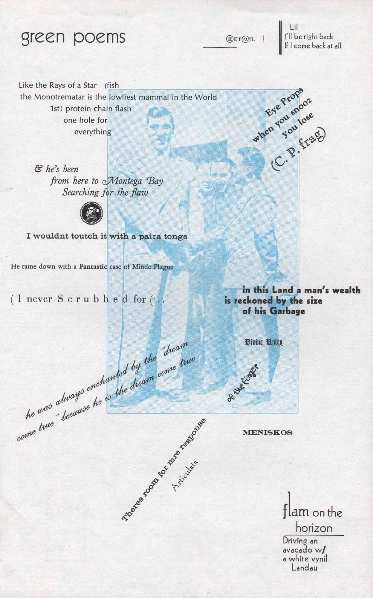
My favorite family of broadsides are those that take the integration of text and image one step further into a state of total immersion. The text is an image and the image is a text. In instances of total immersion, the identity of the author, artist, printer, and designer isn’t always clear, and at times, the nature of the collaboration deliberately defies these traditional roles and responsibilities. These are total ‘works’ in every sense of the word. The ‘text’ is difficult, if not impossible to discern on its own, that is, if an editor were to attempt to type up, say, Ed Dorn’s Green Poems pictured above, for publication in a traditional anthology, they would have to make some substantial decisions about the author’s intention, or simply choose to reproduce the whole work, provided there was no previous fair copy to consult. This curious broadside was produced by Holbrook Teter and Michael Myers at the Kent State Arts Festival organized by Robert Bertholf in 1974. Here’s another produced on the same trip.
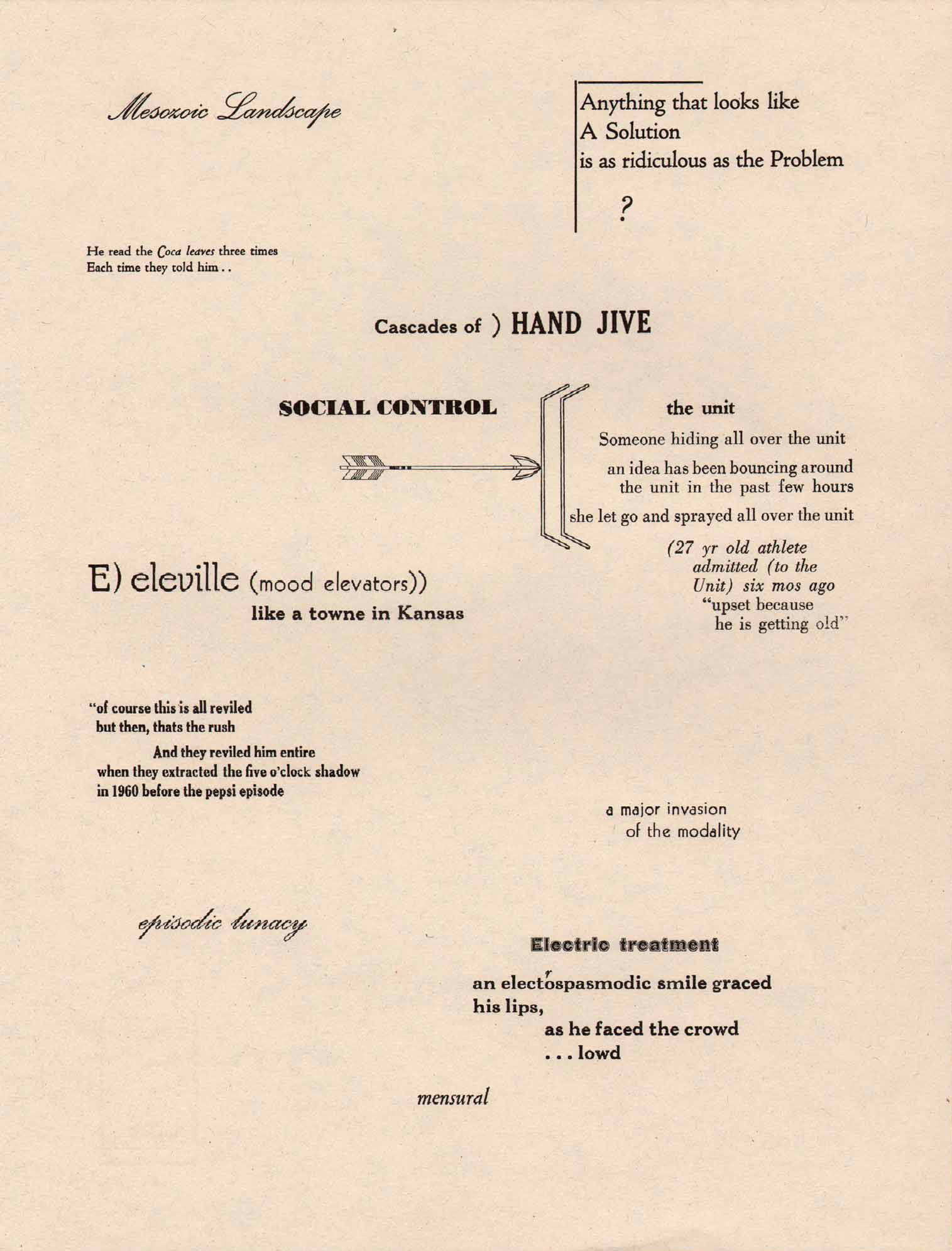
Another poem from the same workshop by Ed Dorn typeset and designed by Teter and Myers with students from Kent State. Each aphoristic fragment is set in a different font, creating different nodes or units of thought and information. One could read this as an interpretation of Olson's Projective Verse, an essay that says as much about the disposition of type on the page as it does about sound, and the embodiment of breath and space in verse.
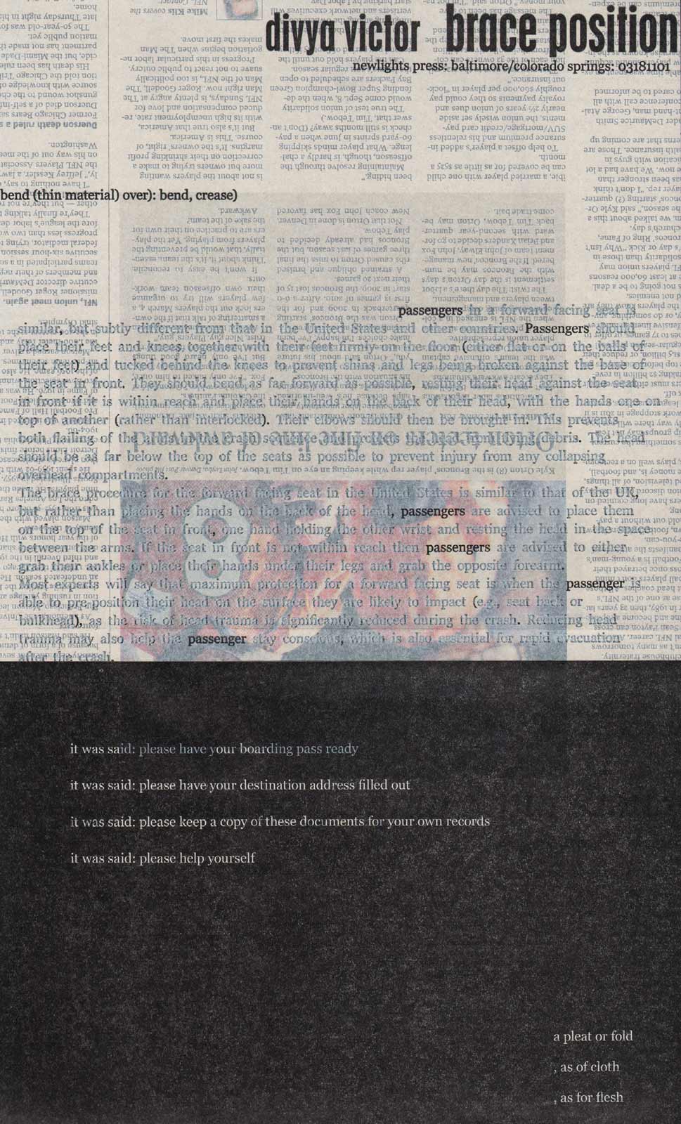
Printed on newspaper for a Small Press Traffic fundraiser, Aaron Cohick’s (NewLight’s founder) collaboration with poet Divya Victor is mind-boggling. Since the paper is newsprint, no two copies are exactly the same. Cohick has applied a solid layer of white ink to the top of the sheet so the images are at once muted and magnified. There is a faint prose block with the word ‘passengers’ printed in black, reminiscent of many erasure poems, such as Tom Phillips’ Humument or Jen Bervin’s Nets. The lower half of the sheet is white text on black, while the back of the sheet is covered in blue.
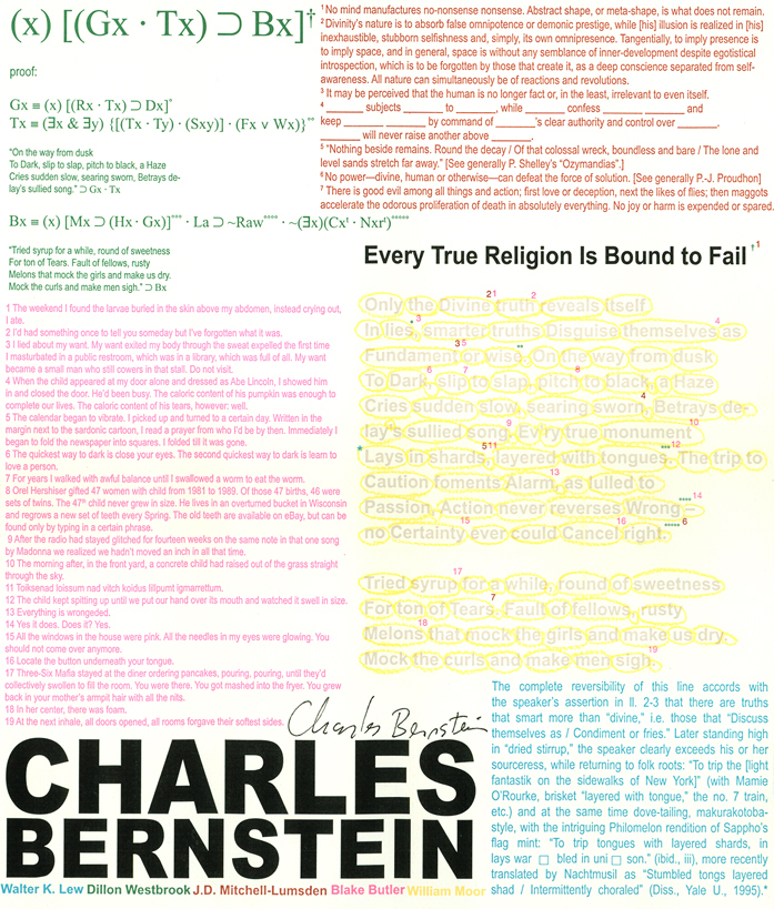
Jeremy James Thompson describes his process: ‘I prefer to collaborate as intimately as possible with the poets whose work I print, but sometimes, as in this case, collaboration is as simple as consent. I asked Charles for a poem, requiring that it be relatively short. I described to him what I have come to call an Annotated Broadside. With his consent, I sent the poem to five poets familiar with Bernstein’s work... I asked them all to annotate the poem, adding that I understood and welcomed the possibility that most of them would take significantly unconventional approaches to the practice of annotation in this instance. After collecting their annotations, I then went to work collaborating with their texts, trying to fit the puzzle together, with the end result being a 12 × 14 page of their annotations, each cast in its own vibrant color, surrounding and subduing the poem, colored a pale grey.’
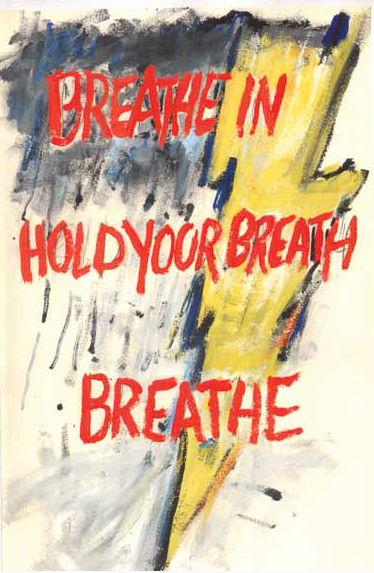
It seems fitting to conclude this presentation by looking at one broadside that is not typographic, in fact, the only one that is as much a painting as anything else. There are many examples of handwritten poems—heck, pretty much everything before 1500—as well as lots of more recent examples, from Emily Dickinson, to Kenneth Patchen, to Robert Grenier. This collaborative painting-poem was conceived by Schneeman and Berkson, painter and poets who have worked collaboratively for decades, sometimes ‘live’ that is, together in the same room, hand over hand, and other times at a distance. Here again, the poem and the picture are completely immersed: text and image and image and text are a unified whole. Color copy signed, titled, and inscribed with date by Berkson in pencil on the back.

![Untitled [top] and The Belt [bottom], 1974 image of broadside by Robert Kelly: As he would contribute / dignity and repose to a man's face / superfixing that found place / on a buddha, / so to my own smooth / babyfatted sleek he finds / a ruinous treebark's grooves and runnels / to arroyo me? / This is what comes of having my picture / taken by a / Stone / who found a tree in my face / and cracked it / tree, I accept the sight / but do I see it at once that way / (our eyes, our easy ones) / or does tree come later, / after the craggy flesh / I thought was mine? / Violence here to be sure / and cruelty, / Light's revenge / upon my caveman eyes. (from a notebook August 74) // The Belt // And I had been caught too long / away from the good places. / There was such need / to speak out all of it, / even Hapgood's dusty maps / of Amundsenland before the ice / or the strings of Chomsky / bracketing / an up and coming sutra / of great subtlety and little sense. / So we have to go there / beyond sense. / It breaks a door / or breaks a bar on a door. / It is full / and fast down the hall / like a moon / it runs / and by its muscularity / encourages pursuit. / I pursue. / But less than should, I who once / did follow, and vanily, to exhaustion / and now perhaps drive / no further than Woodstock or Pine Plains, / my zone / diminishing, / the woman said. Forcing me up. / The squeeze. Of place. The actual. / This / is what I need: / an again / with wings / to carry. / I have been so slow. // VII 74 // Robert Kelly](images/pic-ewc-kschlesinger-belt.gif)
![Kein Kampf, n.d. image of broadside by Anon. (Alastair Johnston) // THE ARYAN PRESS / annnounces the publication of the / Prospectus / for / KEIN KAMPf // ALTHOUGH it will take years to handset the many pages of this overlooked dusk of modem philosophy, the ARYAN Press [formerly Longhorn Alumni] feels confident in announcing the impending publication of the de-luxe offset illustrated prospectus for the edition which will describe : / THE TEXT: a definitive new scholarly edition of the neglected 'Bad Ems' manuscript. / THE FORMAT ; carefully preserving the layout of every preceding fine press edition, guaranteed to fulfill the expectations of even the most antiquated bibliopile. / THE PAPER: an over-run of Federal Reserve stock, gilt-edged to satisfy the most discerning investors without attracting undue attention. Slightly watermarked. / THE FORMAT: hyperbolized quarto, pr hemi-folio, approximately 4 x 5 ins., or 2.3 x 3.9 meters [foreign]. / THE ILLUSTRATIONS: charming School of Baskin and Kent engravings blend in unobstrusively while recaptunng the spirit of the halcyon days before 1939. / THE TYPE: pliable monotype, with a non-aligning 'g' for added sparkle, topped with a serving of special Gouty Swish Terminals, removed during a confusing fire drill at Deepdene, and the keystone of the historic collection of Victorian novelty types which, have been acquited from the incompatible J.H.Gnash and General Business Forms Inc. [the Aldis of San Francisco] / THE BINDING: full quarter Longhorn overboards. Rigorous individual tests show the cords to be suited to the most exacting binding. Not cased-in, bound!! / THE ODOR: a custom blend of 'Leatherette' scents prepared in skilled methods by traditional craftspersons at General Motors Product Development Laboratory. / THE HUMBLE ORIGIN OF THE PRESS: traced back to a lawsuit between emnomically astute Fist and Chauffeur and the impractical inventor of movable types, the so-called Johann Gansfleisch of Mentz. / THE PRESENT SITUATION: from our historic Fiscal St. site, a 'jewel of picturesque antiquity,' we view our future location set into the side of the Transylvanian Pyramid around the 47th floor. / THE FUTURE: to retain its position in the forefront of historic revivalism, the press pledges nothing new. No creative impulses have been allowed to impinge on profit-making motives. / THE EDITION: this genuine Collectors' Item is a bona fido hedge against inflation at the special lowlow investors' introductory price of $999.95. Optional are detatchable kid gloves for $87.50 [Specify S M or L]. / THE PROSPECTUS will be available shortly. Ask your broker to countersign the Purchase Supplication.](images/pic-ewc-kschlesinger-kein-kampf.jpg)
![image of broadside by Poltroon Press: Transitional Face / Great Insignificant Works of Twentieth Century Literature // In keeping with the fine tradition of such contemporary presses as Burning Deck, Tuumba, Black Sparrow etcetera, these works are characterized by feeble editing, bad presswork, monotonous formats, and half-witted design and typography, Pro-duced under the aegis of Poltroon Press [they] are too self-indulgent, slight, or embarassing for (even) the Poltroon im-print. Usually suppressed or given away, we are pleased to offer pre-remaindered copies at the following inflated prices: // vol.1 GNACHOS / Jim Nisbet $7.50 / '' 2 Voices in the Babylonian Static / A. Johnston and Simone O. $4.98 / '' 3 MORPHO / Johnston and Nisbet $7.50 / '' 4 Nine Further Plastics / Steven LaVoie $7.50 // Remit total to : Poltroon Novelty Co. / P.O. Box 5476 / Berkeley, Ca. 94705](images/pic-ewc-kschlesinger-transitional-face.jpg)
