K. S. Ernst
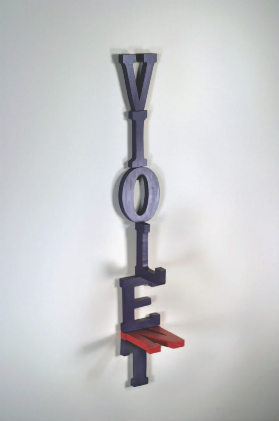
VIOLE(N)T
Wooden letters, screws, and acrylic paint
29.5"h × 3.75"w × 4.75"d
In this sculptural visual poem, K. S. Ernst uses color to demonstrate the way the introduction of a single character can utterly change the face of a word. The drama of the poem takes place within the confines of these seven letters and shifts for the viewer the longer we contemplate the scene. Wooden letters spelling VIOLET in a serif typeface that evokes nineteenth-century storefronts hang vertically against a white wall with no leading between them—V atop I atop O, etc. The tightly stacked letters of this word have been painted a purple hue that reflects the flower and shade it names: violet is violet is violet. Yet towards the bottom of the piece, a red N has been inserted between E and T at right angles with the text. Standing out from the wall, its edge is pressed between the foot of the E and the arms of the T: is it pinned by its companions or forcing them apart? Here we find the central paradox in this deliciously and deceptively simply piece, which raises the question of who or what perpetrates the title’s violence. N’s red color might equally suggest the aggressive way it has been jammed into the text (we might say it enjambs the poem’s one word, spreading its legs) or demonstrate its own Steinian “hurt color,” pressed as it is in the vice-grip of E and T. Perhaps the violence of this insertion lies in the fact that these colors normally appear at opposite ends of the spectrum: violet turns violent when it sees red.
But the text’s arrangement reveals a deeper parable at play beneath the purple pun. If there is violence in the way N has been forced into the text, we also can’t ignore L’s sideways orientation—it stands out from the wall, projecting a foot ninety degrees from the plane against which it stands. Does its sideways arrangement suggest L “turns aside” from violence? Or is it looking out for N, peering over E’s edge, afraid to “let” something terrible happen? The L, like the viewer, contemplates the scene. It is part of the word VIOLET, but also separate from it, refusing to stand in place with its back to the wall. This disobedient move reminds us that the piece’s verticality itself does violence to our usual reading strategies. Ernst prevents us from taking the word in all at once: the L and N are only visible from certain angles, situated as they are on different planes from one another and from the rest of the text.
This experiment in color quickly becomes an allegory of violation and witness in which perspective plays a role. The framing of the image is essential, since Ernst has chosen to photograph the sculpture in three-quarters view. The picture thus evokes portraiture, the L standing out from the type’s face like a nose, the red N providing a mouth where the silent (parenthetical) inclusion is trying to speak. The embodied terminology of type is no coincidence—we do violence to the body of language every day by silencing others and keeping silent, by appropriating words and putting words in others’ mouths. Here, violence bites its tongue, holding back harsh truths beneath purple prose. Viewed from the front, however, the piece changes, the rebellious L now legible to us in lower case, shorn of foot and serifs: VIO|ET. Having lost these limbs, the L is wounded, but it works. In this perspective, the N is minimized into a red underline, emphasizing the E under whose bootsoles it is trapped. It disrupts the word, but not nearly as potently as before. The violence is now located in the viewer, who has become an actor in the piece, transforming the text by merely stepping to one side. If language can be so easily mangled and misunderstood, the piece seems to imply, we must tread carefully, acknowledging our role in shaping the text.